
Advanced Custom Fields version 6.0 is now available! 🚀🎉
This release includes a new plugin UI refresh for both ACF 6.0 and ACF PRO 6.0, pagination for repeater fields with large amounts of data, and new generation of ACF Blocks.
This has been a big effort from all involved. Thanks to all those that tested out the beta and RC releases we’ve put out over the last few months.
ACF PRO 6.0 is available to all lifetime license holders and active subscription customers.
👨💻 Please find the release notes below. For the latest ACF news, follow us on Twitter @wp_acf.
Let’s get into it.
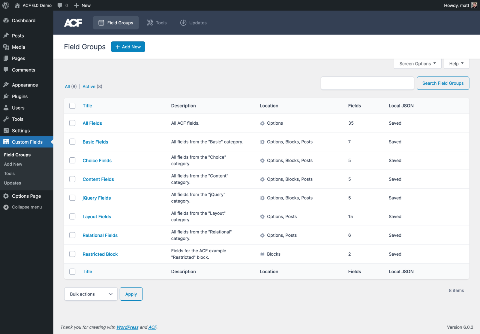
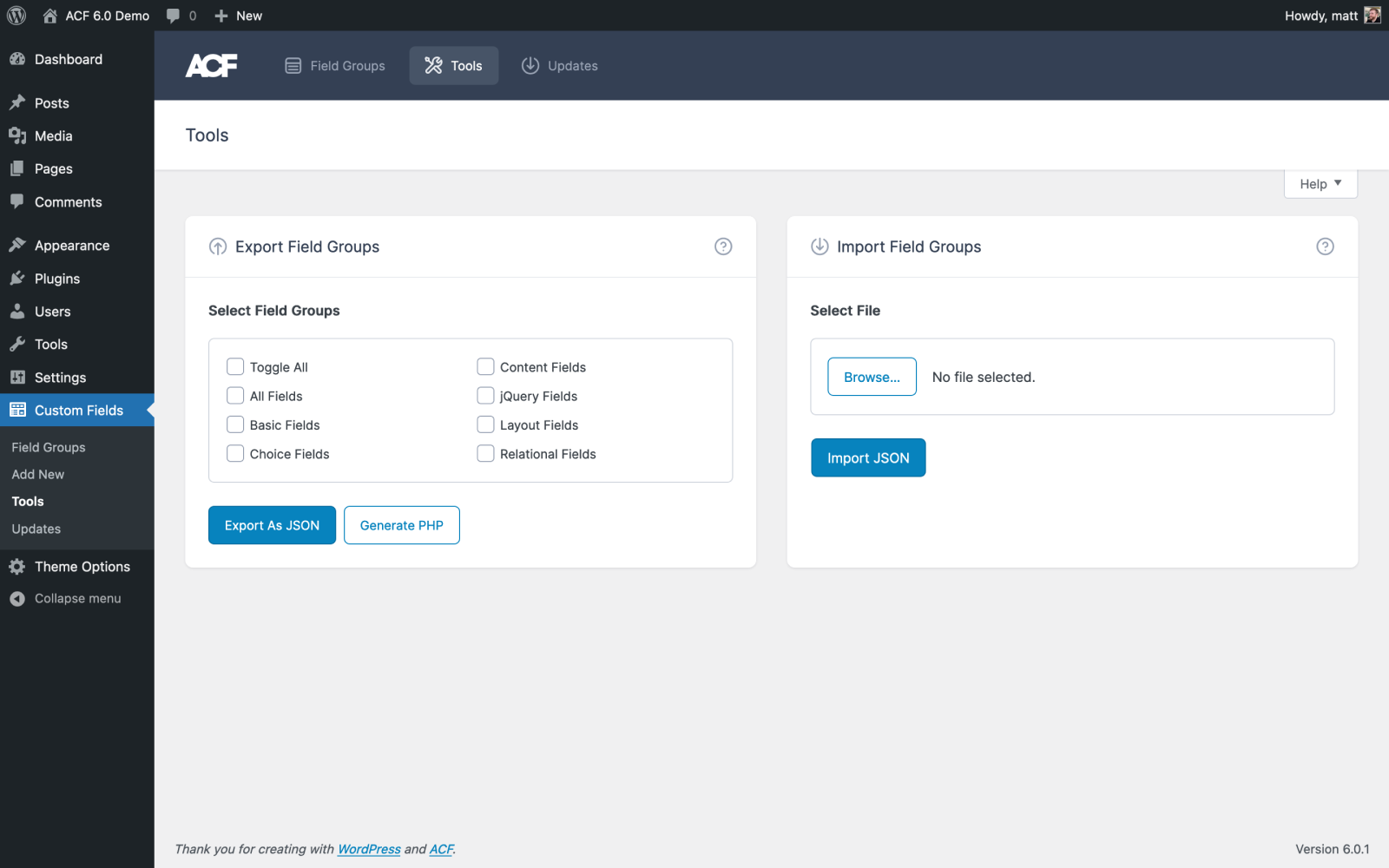
A Fresh New UI
It’s been some time since the ACF UI has had a lick of paint, and there’s a good reason for that. It’s worked so well since it was introduced and has always felt native to WordPress’ own UI. However, never changing something or improving on it isn’t a path we want to take. We’ve been planning a refresh of the UI for sometime, to try and keep the plugin inline with other Delicious Brains plugins that had been refreshed recently, such as WP Migrate.
It’s something that has been on the minds of ACF users as well. When we acquired the plugin in 2021, we reached out to users to ask for the top 3 things they would like to see. UI improvement requests were a common theme:
“Improve the UI so that users without any expert programming knowledge can create and use the product.”
We didn’t want this to be a huge change that would disrupt a user’s workflow, but instead a light reskin that focuses on bringing user experience improvements to the Field Group editor.
The team have done a great job with the new design, improving all the ACF plugin admin screens from the Field Group editor to the Tools page.
This new design has only been applied to the admin area of the plugin, it has not been applied to the edit screens where content editors use the custom fields, or frontend forms.
Let’s take a look at the new UI and walk through the specific user experience improvements.
Reducing the Vertical Height of the Field Settings
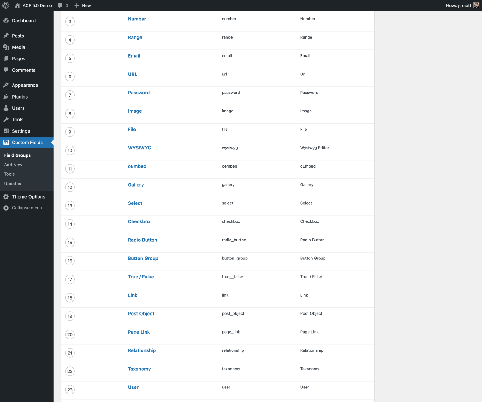
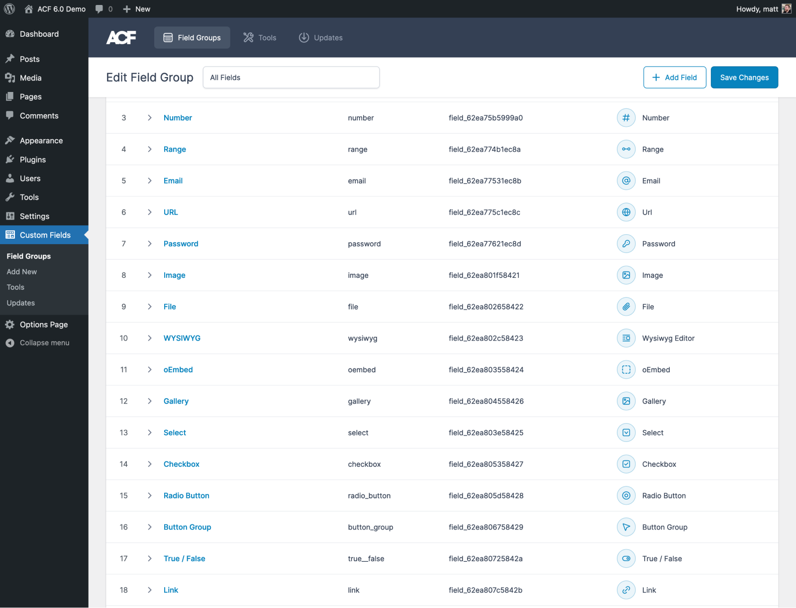
Depending on the field type, the field settings screen can take up a lot of vertical space. This leaves little room for the other fields around it and makes it hard to navigate around. Not all these settings are typically used when editing fields.
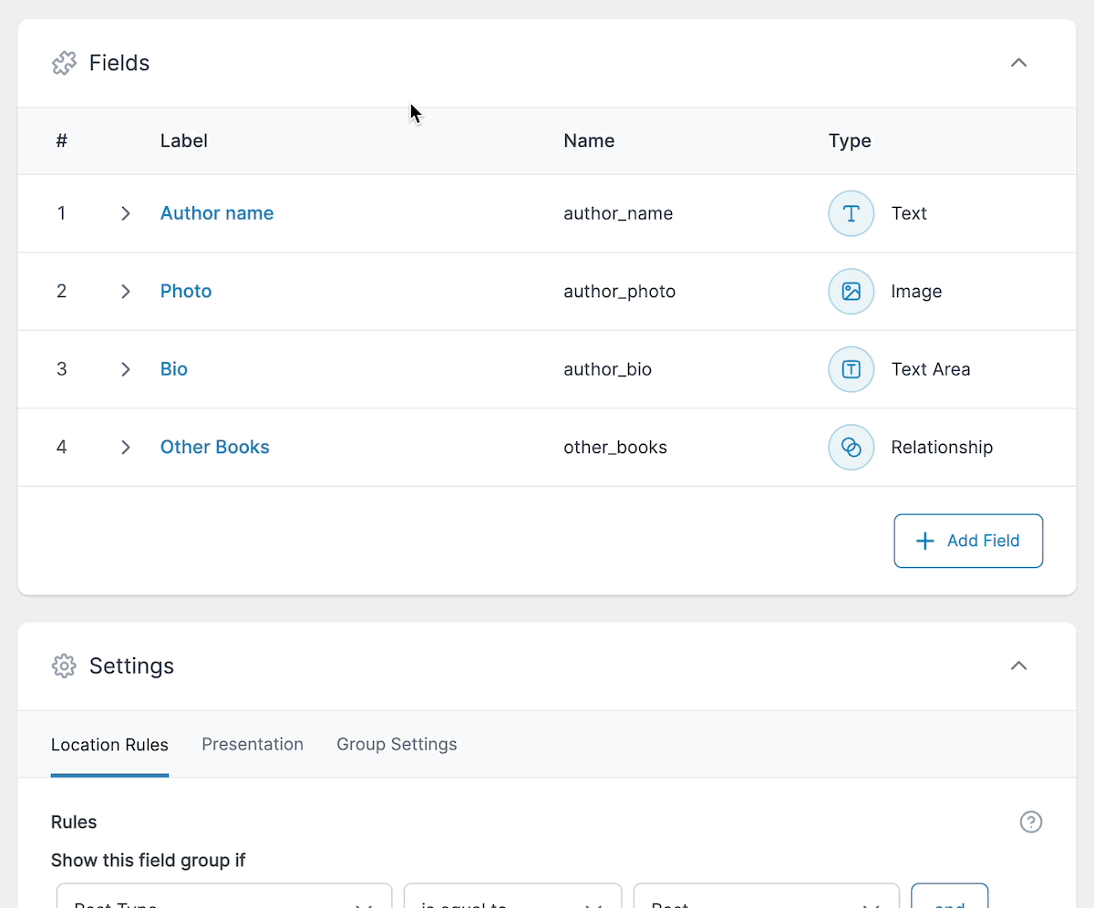
In ACF 6.0 we’ve reorganized the field settings into tabs that logically group the settings and reduces the height a single field takes up on the screen.
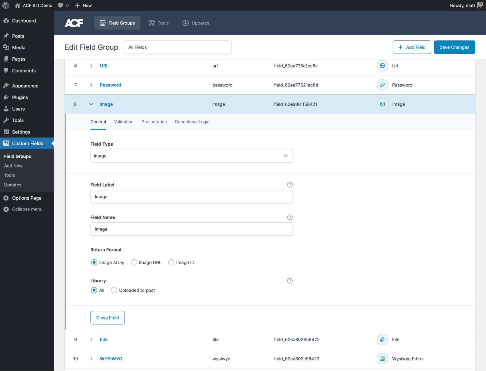
Adding New Fields
When you’ve got a Field Group with a large number of fields, it can become difficult to navigate and even harder to scroll to the bottom just to add a new field.
In the 6.0 UI refresh we’ve improved the header bar so that it scrolls down the page and has a button to add a new field:
Improved Save
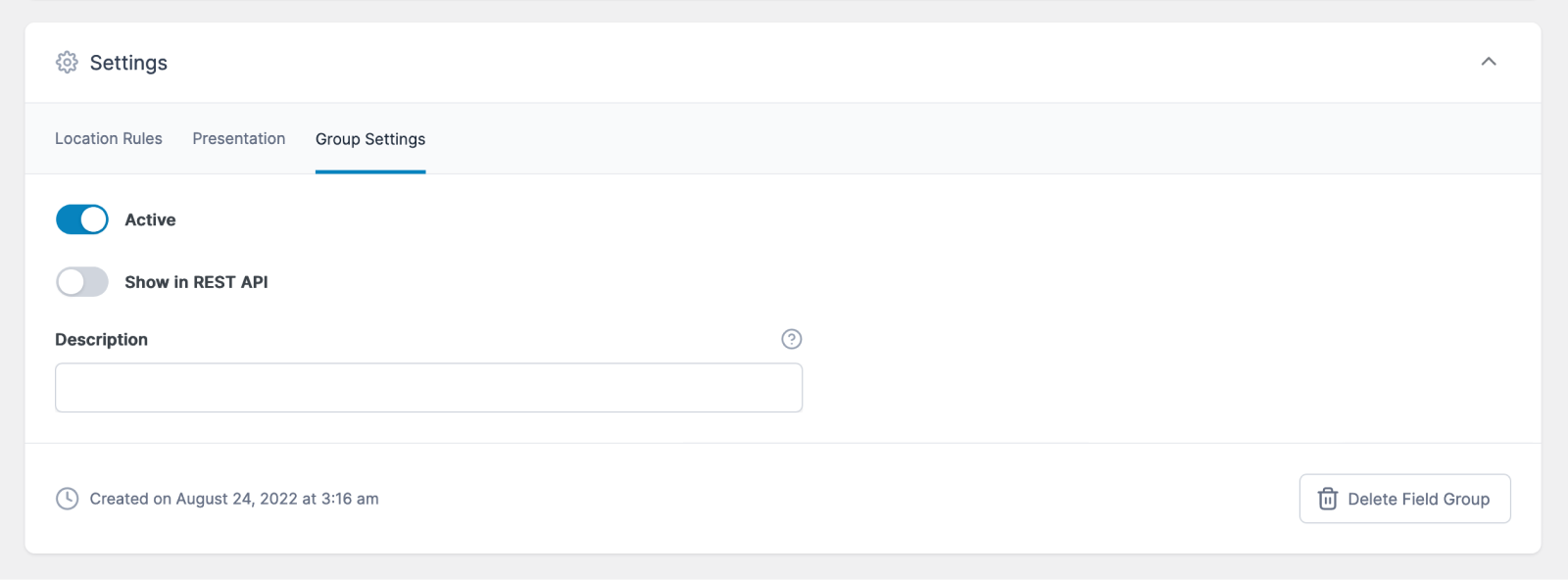
That new header bar also contains a “Save Changes” button that’s always visible. This allows you to save your changes without scrolling up to the top of the page to access the Publish metabox in the sidebar.
We’re removed that metabox and moved the button to delete the Field Group, status toggle, and published date to the “Group Settings” tab of the “Settings” box below the fields:
Removing the sidebar allows us to give the “Fields” box more width. This helps with field types that have nested subfield interfaces that can get pretty cramped. We’ve tried to improve the nested subfield UI even further to make this much easier to edit:
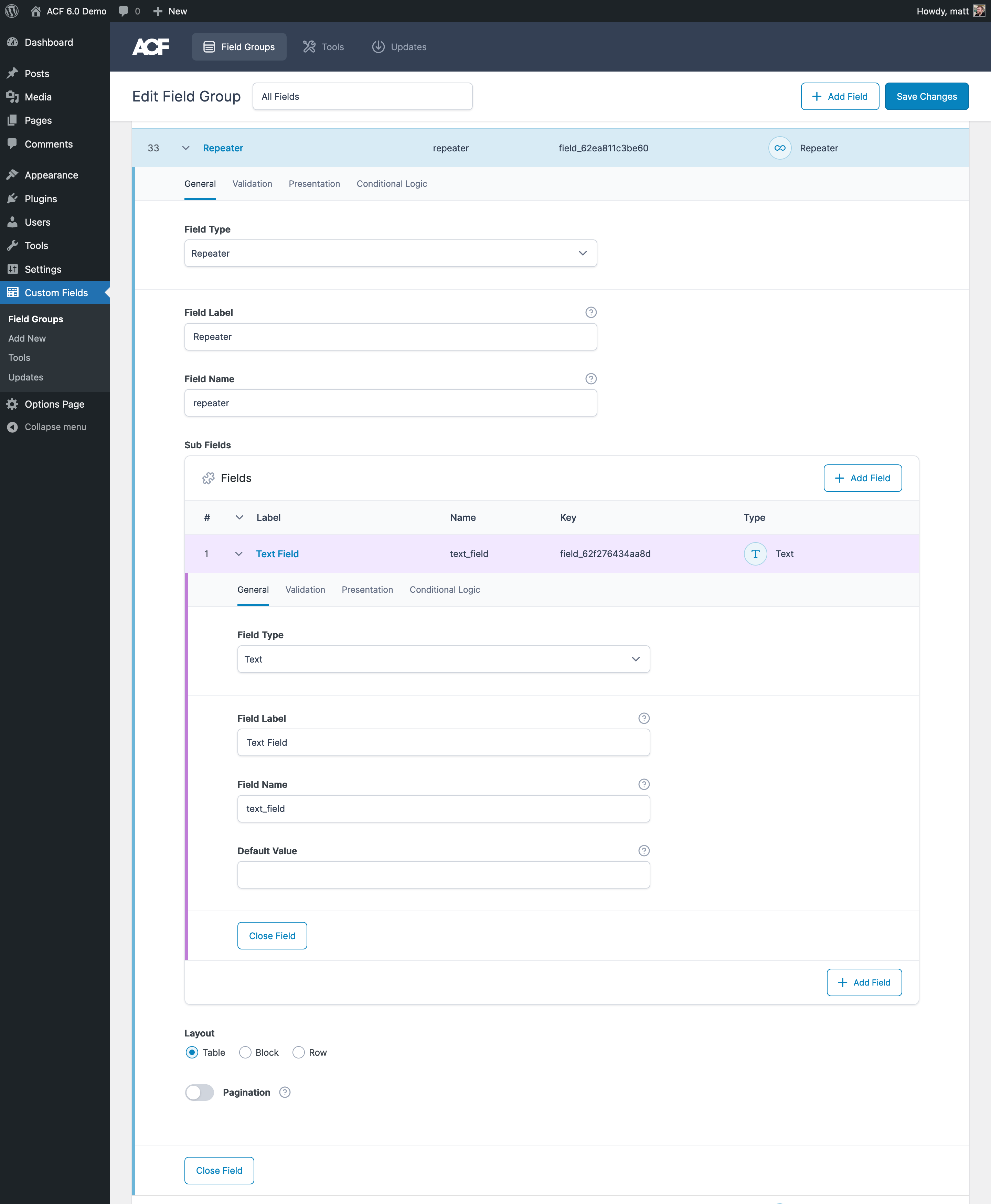
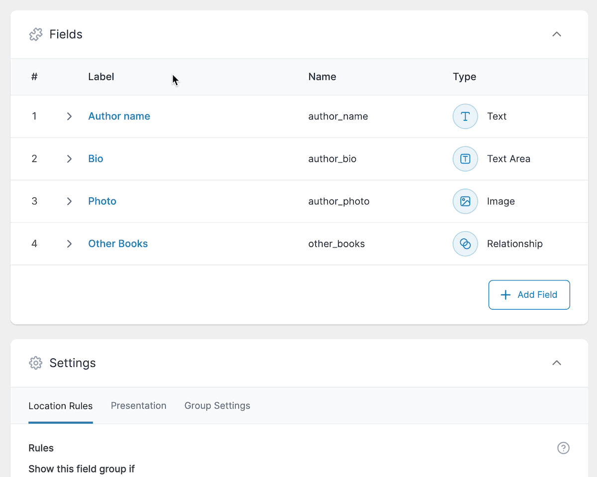
Reordering and Collapsing Fields
It’s never been particularly clear that once a field is open revealing its settings, that you can close it again by clicking the field label or the “Edit” link again. I’ve spent more time that I’d like to admit scrolling down to the bottom of the field settings to find the “Close Field” button, which as I’ve already mentioned, could be quite far down!
We’ve improved the opening and closing of a field by being able to click anywhere in the field header bar to toggle it open or closed. We’ve also added a chevron arrow to indicate when a field is open or closed.
Reordering has been improved with the addition of an icon on hover that indicates the field can be dragged around to be reordered.
Accessibility
The free version of ACF is installed on over 2 million websites. Along with the ACF PRO plugin users, this is a large number of users who have different accessibility needs. Just like in our other plugins, we are committed to improving accessibility in ACF and that work has started in ACF 6.0.
Keyboard Navigation for Fields
One of the biggest accessibility issues when editing a Field Group is accessing the fields and their settings with only the keyboard. Before 6.0, there was no way to edit fields without the mouse. I’m pleased to say that along with the new UI for the Field Group editor, we have made editing fields with the keyboard possible:
Better Focus States
When using only the keyboard to navigate a UI, it is essential to be able to see where you currently are using focus states for elements.
We’ve improved the focus styling across the Field Group editor, as well as adding much needed focus states to toggle switches, radio buttons, and checkbox groups.
Repeater Pagination
Over the years we have had many support requests from users who have been storing a large amount of data in Repeater fields. This can result in performance issues for the users filling out the data.
Currently, when a user loads the edit page in the WordPress dashboard, ACF loads all the rows of data with all the subfields for each row. Depending on the number of rows and subfields, this can take some time, increasing the overall admin page load time and blocking the user from performing actions like saving the post.
When the post is saved, ACF will send all the subfields for every row back to the server to be updated, even if the data hasn’t changed. This can lead to memory issues, running into the PHP max_input_vars setting, and the data not being saved correctly.
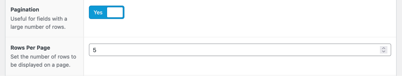
With the 6.0 release we have introduced a new setting for the Repeater, which enables pagination of the records when editing the data.
Please note, the pagination setting is opt-in. It is not enabled by default and will not be turned on for existing repeaters.
Enabling Pagination
You can enable pagination by editing a repeater field and turning on the “Pagination” setting. Once enabled, a new “Rows Per Page” setting will be displayed as well:
Things to Note
There are some user experience changes unique to paginated repeaters, which should be a consideration before using the setting.
With standard repeaters, you could reorder rows via a drag-and-drop interface. This doesn’t work with paginated repeaters, as you may need to move an existing row to a different page. Instead, we’ve added the ability to reorder rows by clicking the row number. This will reveal a number input which can be used to designate where the row should be moved to:
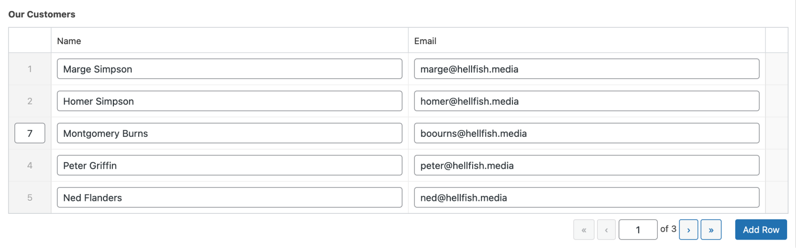
Once you designate a new row number and update the page, the row will be moved to the new location.
Rows that have been inserted in between existing rows and duplicated rows cannot be reordered until the page has been updated. As such, there is currently no row number displayed next to these rows. We’re looking into adding a useful placeholder here to better illustrate that these new rows have been added, but cannot be reordered.
Also, repeater pagination will not work for fields used inside an ACF Block, as there would be no performance benefit given the repeater data is already stored in the DOM.
Currently pagination isn’t available in repeaters inside other repeaters, or in flexible content field layouts.
A New Generation of ACF Blocks
In the last few releases of WordPress, Gutenberg has made significant changes to all aspects of the block editor and block registration, and this has impacted ACF Blocks. We’ve not been able to move as fast as we would have liked on implementing changes to support these new features for back compatibility reasons, so are excited to announce that ACF 6.0 contains a new block versioning system, allowing you to opt in to new versions which will change things like the markup and structure of ACF Blocks in both the backend and frontend, and may require updates to your theme to support.
ACF 6.0 includes ACF Blocks Version 2. This next generation of ACF Blocks brings us much closer to the native block experience, while still giving you the PHP based templating language you know as a WordPress developer.
Many of our fixes will also apply to existing ACF Blocks. These will remain supported for as long as WordPress supports the previous methods of block registration.
Learn more about all the changes to ACF Blocks in ACF 6.0 here.
Backwards Compatibility
ACF 6.0 is designed to be fully compatible with ACF 5.x and the vast majority of users will be able to upgrade without changing any code.
There are a couple of areas of backwards compatibility that may need some extra work:
- If you have customized the settings for a field type
- If you have used ACF Blocks and rely on a unique block ID in your templates or you use
parse_blocks()and require a block ID
More Goodness
Translators
ACF 6.0 introduces a new way of collecting translations from our wonderful contributors, better leveraging the WordPress translation system for the free plugin.
This means ACF 6.0 introduces 10 new languages (or language variants) and updates almost all of the existing ones.
Learn how to help translate ACF and ACF PRO.
These are just the highlights of all the features, improvements, and bug fixes bundled in this release. To see a full list of all the updates, take a look at the changelog.
What’s Next
We’ve got lots of good stuff planned for the near future, including the ability to register custom post types and taxonomies in the UI, as well as improvements to how field types are selected.
Thanks to everyone in the ACF community who helped make this release possible. 🙌
Are you excited about the new UI and other new features and improvements in ACF 6.0? Let us know in the comments below or on Twitter.

For plugin support, please contact our support team directly, as comments aren't actively monitored.