
Description
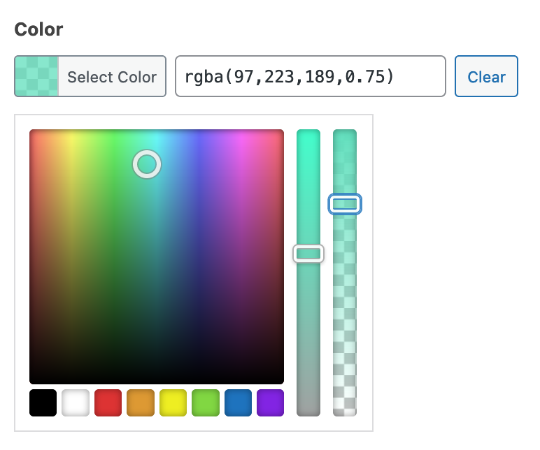
The Color Picker field provides an interactive way to select a hex color string using Iris.
Screenshots
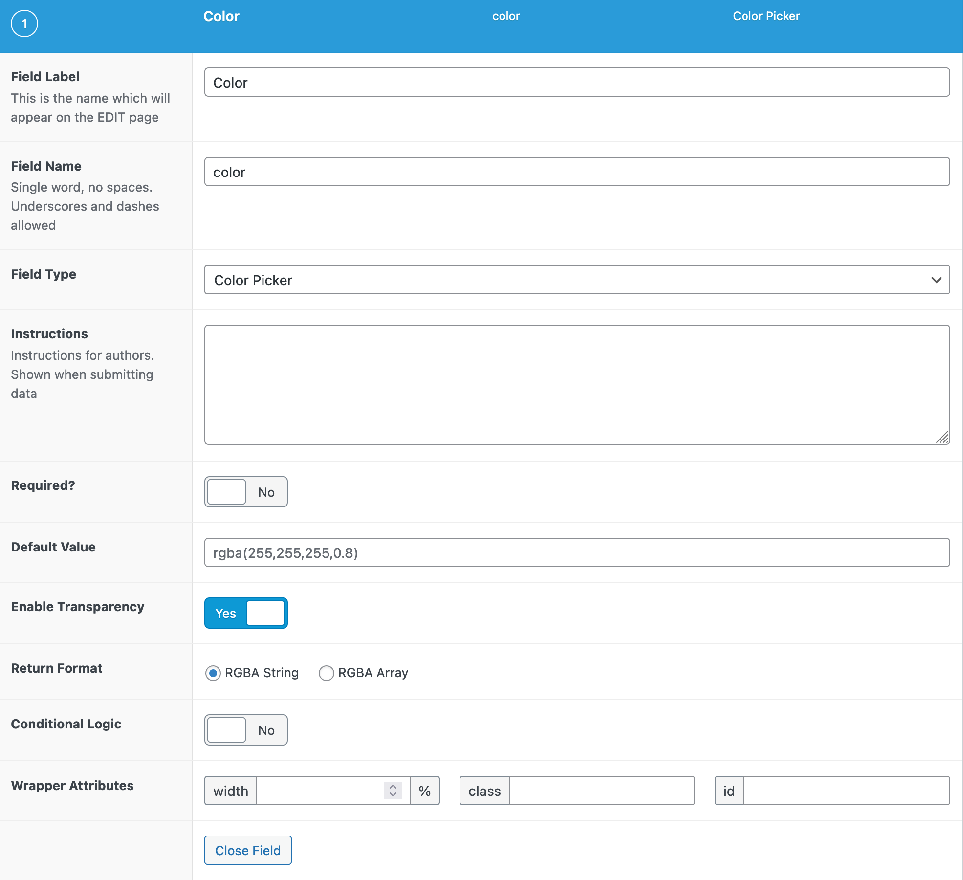
Settings
- Default Value The default value initially loaded into the Color Picker when first editing the field’s value.
- Enable Transparency
Enable transparency control on the color picker. If enabled the Return format options switch to RGBA string or RGBA array. - Custom Palette Define the available colors shown with the field. It accepts a comma-separated list of hex codes. Each hex code will be a default color shown in the palette. This setting can be found under the “Presentation” tab for the field settings.
- Use colors from theme.json If your theme contains a theme.json file, the colors defined there can be used as the color palette. To use this option, enable “Custom Palette”, ensure you have a supported theme, and choose “Use colors from theme.json”
- Show Color Wheel Set whether the Color Wheel should be shown or hidden. When hidden, only the color palette will be shown, along with the text field where the actual value is defined. This setting can be found under the “Presentation” tab for the field settings.
Template usage
The Color Picker field will return a string value containing the HEX color value including the prefix ‘#’. Below are examples using a Color Picker field named “color”.
Display value within inline styles
This example demonstrates how to generate an inline style using a Color Picker value.
<div style="background-color:<?php the_field('color'); ?>">

</div>
Display value within style tags
This example demonstrates how to generate a CSS class using a Color Picker value.
<style type="text/css">
.primary-background {
    background-color: <?php the_field('primary_background_color'); ?>;
}
</style>

<div class="primary-background">

</div>
Notes
Customization
The Color picker field modal can be customized via the JS filter color_picker_args.
Supercharge Your Website With Premium Features Using ACF PRO
Speed up your workflow and unlock features to better develop websites using ACF Blocks and Options Pages, with the Flexible Content, Repeater, Clone, Gallery Fields & More.
PRO Features
ACF Blocks
Options Pages
PRO Fields
Repeater
Flexible Content
Gallery
Clone
Related
- Choice: Radio Button
- Choice: Checkbox
- Choice: Button Group
- Field Types: Time Picker
- Field Types: Date Picker
