
Description
The Select field creates a dropdown list with selectable choices.
Screenshots
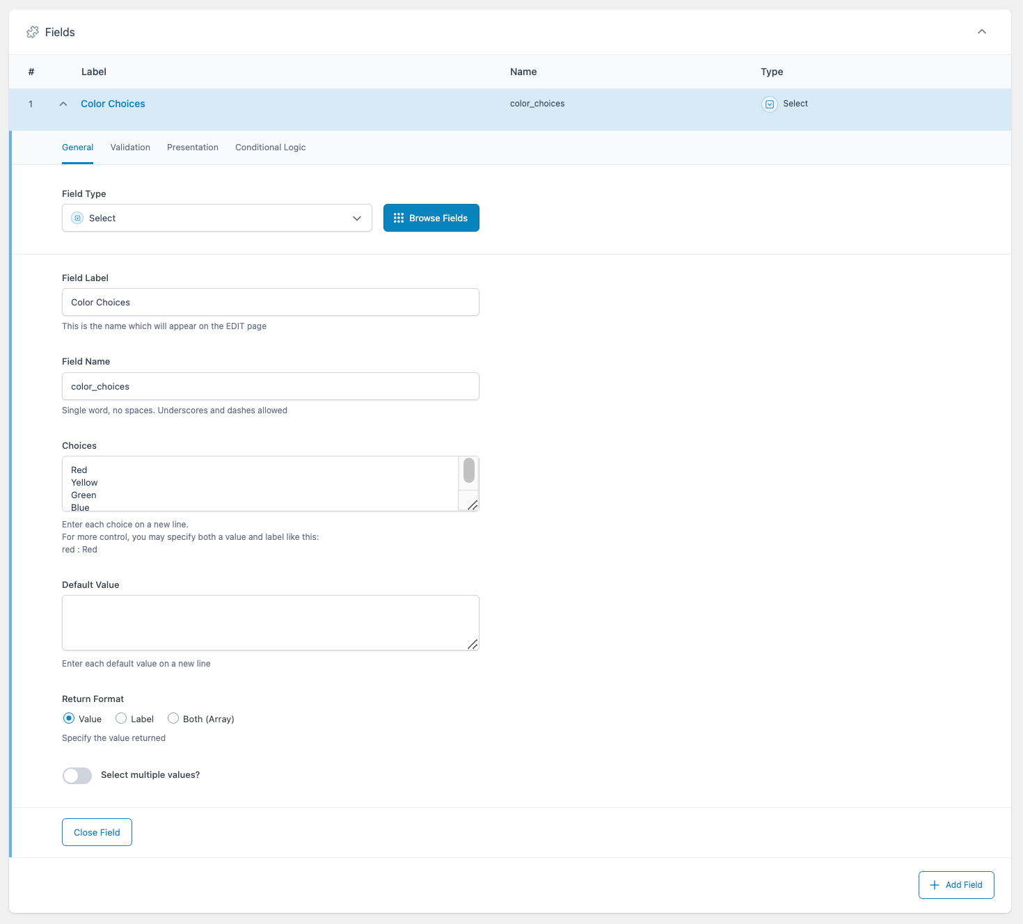
Creating a Select field in an ACF field group.
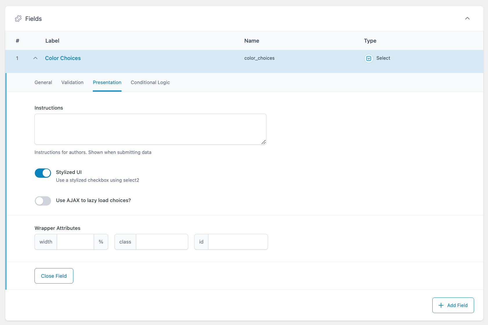
Settings on the Presentation tab impact how the field will appear to content editors.
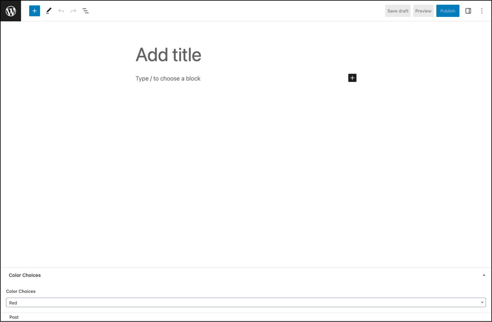
An example of how the Select field might appear to content editors.
Changelog
- Added
Return Formatsetting in version 5.4.0. - Added
Stylized UI(Select2) setting in version 5.0.0. - Added
Create OptionsandSave Optionssettings in version 6.4.1
Settings
Choices
The choices displayed by the Select field. Enter each choice on a new line using the field’s label (eg.Red). For more control, you may specify both a value and a label like this: ‘red : Red’.Default Value
The default value(s) selected when first editing the field’s value. Enter only values, not labels.Return Format
Specifies the value format returned by ACF functions. Choose from “Value,” “Label”, or “Both (Array)”.Select Multiple Values?
Allows more than one choice to be selected. If using the “Stylized UI” setting, you may also drag and drop to reorder the selected choices.Required
Found on the Validation tab, this prevents the field from accepting empty values. Defaults to off.Allow Null
If selected, the list will begin with an empty choice labeled “- Select -”. If using the “Stylized UI” setting, this choice will be replaced by an ‘x’ icon allowing you to remove the selected value(s).Instructions
Shows instructions to content editors when submitting data.Stylized UI
This setting uses the Select2 JavaScript library to enhance your Select field with more functionality, such as search, AJAX, and reordering.AJAX
This setting appears if using the “Stylized UI” setting. It uses AJAX to dynamically populate the Select field’s choices, helping to speed up page loading when using the acf/load_field filter.Create Options
Allow content editors to create new options by typing in the Select input. Multiple options can be created from a comma separated string. Requires the “Select Multiple” and “Stylized UI” settings to be enabled.Save Options
Save created options back to the “Choices” setting in the field definition. Requires the “Create Options” setting to be enabled.Conditional Logic
Enabling this setting allows you to customize the logic which determines if the current field should be visible. Groups of conditional logic rules can be created to allow for multiple and/or statements.
Template usage
Display single selected value
This example demonstrates how to load and display a single selected value.
<p>Color: <?php echo esc_html ( get_field('color') ); ?></p>
Display multiple values
This example demonstrates how to load and display multiple selected values.
<?php
$colors = get_field( 'color' );

// Create a comma-separated list from selected values.
if( $colors ): ?>
<p>Color: <?php echo implode( ', ', $colors ); ?></p>
<?php endif; ?>
Display value and label
This example demonstrates how to load a selected value and label without using the “Return Format” setting.
<?php
$field = get_field_object( 'color' );
$value = $field['value'];
$label = $field['choices'][ $value ];
?>
<p>Color: <span class="color-<?php echo esc_attr($value); ?>"><?php echo esc_html($label); ?></span></p>
Load value and label with Return Format
This example demonstrates how to load a selected value and label using the “Return Format” setting, in this case set to “Both (Array)”.
<?php
$color = get_field( 'color' );
?>
<p>Color: <span class="color-<?php echo esc_attr($color['value']); ?>"><?php echo esc_html($color['label']); ?></span></p>
Conditional
This example demonstrates how to use a selected value to conditionally perform a task. In this case, the conditional is checking to see if red matches the selected option.
<?php

if( get_field('color') == 'red' ) {
    // Do something.
}
Supercharge Your Website With Premium Features Using ACF PRO
Speed up your workflow and unlock features to better develop websites using ACF Blocks and Options Pages, with the Flexible Content, Repeater, Clone, Gallery Fields & More.
Related
- Basic: Text
- Choice: Radio Button
- Choice: Button Group
- Choice: Checkbox
- Field Types: Post Object
